The short answer
Home printers don't print white. Anything white in your design comes out as the color of the label itself, so white text disappears on clear, kraft and colored labels, and light colors fade into the background. Design with dark text and strong colors, check the design against the label's color before you print, and save white backgrounds for white labels.
Clear, kraft and pastel labels give a product a look white labels can't, but they behave differently in a printer. Here's what to expect from each, and how to design so the label you print matches the one on your screen.

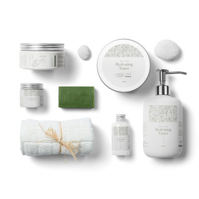
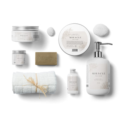
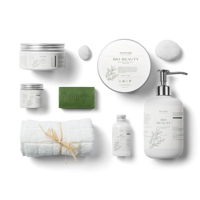
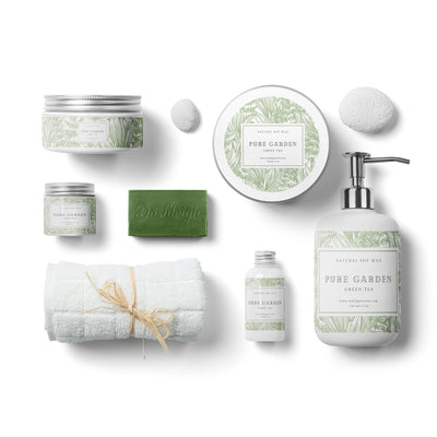
Illustration: how one design prints on each label type.
Why white disappears
Inkjet and laser printers build color by adding ink to the page. White is where no ink goes. On a white label that works, because the label is white. On a clear label, the "white" areas are see-through; on kraft they're brown; on pink paper they're pink.
Inkjet ink is also slightly see-through, so every color mixes with the label underneath. That's why colors look darker and warmer on kraft, and why yellow text on a blue label turns green.
Clear gloss labels
Clear labels give a printed-on-the-bottle look. They work best when the container and its contents are light.
- Use dark text: black, navy, deep green or deep burgundy. Thin or pale lettering gets lost against the glass.
- Think about what's behind the label. On a clear bottle the contents show through. Dark liquid, amber glass or a colored candle will swallow dark text, so choose white vinyl for those instead.
- No white backgrounds or white text. If your logo has a white box around it, remove the background or save a version with a transparent background (PNG).
- Print settings: clear gloss is inkjet only. Set the paper type to Glossy or Labels and the best quality, and let the sheet dry 15 minutes or more before you touch it.
- Skip heavy color blocks. Large solid areas use a lot of ink on a glossy surface and take longest to dry.
A good fit for clear: wine and spirit bottles with light contents, candle jars with pale wax, pantry jars where you want the food to show. Try it on 4 x 5 in. wine bottle labels, which come in clear gloss, waterproof white vinyl, kraft and recycled white.
Kraft labels
Brown kraft gives a natural, handmade look and works in inkjet and laser printers.
- Best colors: black, charcoal, dark brown, forest green, navy and deep red. They read clearly and look rich on kraft.
- Avoid: white, cream, pastels, light gray and yellow. They print as a faint tint or not at all.
- Photos: they print dark and muddy on kraft. Simple line art, icons and type look better.
- Expect colors to shift warmer and darker than on screen. Print a test on one label or a scrap of kraft before a full sheet.
Kraft in stock now: wine bottle labels, lip balm labels with security seal and dog bone shaped labels for treat bags.
Pastel and colored paper labels
- Treat the label color as your background. White and anything paler than the label won't show.
- Colors mix with the paper: blue ink on pink paper leans purple, yellow on blue leans green. Choose colors that already work with the paper, or stick to black and dark tones.
- Pastel labels are uncoated paper, so they print in inkjet and laser printers.
Try pastel pink and baby blue on 8 x 2 in. water bottle labels for showers and parties.
Preview it in Canva before you print
- In your Dashleigh template, add a rectangle the size of one label and set its color to match the label: about #C49A6C for kraft, #F6D6DC for pastel pink, or the color of your bottle for clear.
- Send it behind your design (Position > Backward).
- Change anything white in your design to that same color. Whatever disappears now will disappear when you print.
- Delete the rectangle before you download. It's only a preview.
The preview is close, not exact: real ink looks a little darker and softer on kraft and colored paper. Print one test label to confirm.
When you need white
If white is part of your brand (white lettering on a dark band, a white logo), print on waterproof white vinyl or white paper labels and make the dark area part of the design. A home printer can't add white to clear or kraft labels; that takes a commercial printer with white ink.
Quick reference
- White vinyl / white paper: anything prints, including white (as the label itself).
- Clear gloss: dark text, light containers, no white. Inkjet only; let it dry.
- Kraft: dark, rich colors; no white or pastels; simple graphics.
- Pastel paper: the paper is your background; dark text reads best.
New to designing in Canva? Start with how to design your Dashleigh labels in Canva. Printing on clear or vinyl? See the printer checklist for paper type and drying settings.
Still stuck? Email customerservice@dashleigh.com with your template number and a photo of your test print, and we will help.